
Helping consumers buy property at auction more easily from anywhere.
“Buy” is a public-facing website for consumers to buy property. It’s essentially a collection of properties listed for sale, created automatically by agents when they take a property to market.
Buyers typically receive a direct link to a listing page by the agent or by clicking through from one of the main property search platforms. The page gives interested parties the opportunity to take a number of actions, depending on the method of sale. For properties listed for auction, the site features a live auction function where interested parties can register and then bid at auction live online from anywhere in the world.
Previously, this site was created by another company that was purchased by Realtair and merged with their existing products. It had a number of legacy issues that needed solving. The business objective was to create a unified and uplifted consumer experience, meeting the needs of both consumers and customers.
Over several months we redesigned the whole site but for this case study, I’ve focused on the live auction experience.
As the UX lead, I led the discovery and design activities with the cross-functional team including:
Heuristic evaluations and data analytics reviews in Fullstory
Interviewing, synthesising and delivering findings, creating artefacts such as archetypes and journey maps to build team empathy and understanding
Facilitating workshops and co-design with stakeholders and cross-functional team.
Creating user flows, wireframes and prototypes, user testing and iterating
Ensuring complexities were detailed and articulated during handoffs with developers
My role

Using a 30/60/90 framework, we held milestone check-ins throughout the project, enabling stakeholders and senior leaders to keep track and provide regular input
Discovery
Buyer interviews and creating archetypes
To prepare the ground, I interviewed buyers to get an understanding of our end users, their context, challenges and what they needed to do with our product.
Some key themes:
Transparency and trust - depending on experience, buyers typically lack knowledge of the buying process and need guidance on the steps involved. They rely heavily on people around them for advice which means trusting those people to help them make important, life-changing decisions.
Most buyers expressed anxiety around auctions. They highlighted the experience being intimidating and designed to pressurise them into making quick decisions, risking spending more than they could afford/budget for.
We discovered the typical team and relationships that a buyer builds around them to help them through the process, the roles they play and how they fit together
I created archetypes to articulate some of the nuances we discovered as well as to build empathy across the team. We used these archetypes as reference points in later activities such as journey mapping.
We used archetypes like this to help build empathy and understanding within the team for who was using the product
Heuristic evaluations and data analysis
I conducted a detailed usability review using Jakob Nielsen’s 10 usability heuristics and looked at data analytics in Fullstory. This helped us gather clues on how users were typically engaging in auctions, what devices they were using and where they were stumbling or finding workarounds. I made a prioritised list of UX recommendations.
I found widespread use of industry jargon, poorly phrased questions and options, missing on-screen guidance as well as poorly written automatic messaging from the system which confused and frustrated users.
We had layout issues with missing headings and hierarchy, key information such as the bidding activity only visible below the fold. This resulted in users constantly scrolling up and down during live auctions. This was adding to the intensity and stress of the situation for users.
We had critical information at key moments such as the auction being paused by the agent being missed. This meant bidders sometimes thought they had made a bid but in fact, the auction was already paused. It was being caused by other pieces of UI such as floating toast notifications obscuring the information on the page behind.
The experience on mobile devices was especially challenging with small clickable elements, key information below the fold and common scenarios simply not being catered for requiring alot of manual assisting from agents to get bidders registered and into the auction.

Previous auto-created listing pages had missing important information about the property. It was hard to scan, lacked hierarchy and clear labels. They often featured distorted images and inaccessible colours too.
Stakeholder discovery workshop
I facilitated a workshop with business stakeholders, SMEs (auctioneers and ex-sales agents working for Realtair) and the cross-functional team to get alignment and agree the next steps. This covered business goals, objectives, the scope of what we’re building, for who and why. We considered what we knew from the heuristics and data reviews, feedback from the customer support teams as well as supporting qualitative insights from the previous interviews.
It revealed several areas to improve to better meet our customer’s needs such as providing more continuity and options to hero their brand and some desired functionality not previously offered.
Opportunities
We identified key opportunities for improvement, primarily focused on catering fully for 4 key scenarios. Each one had quite different legal requirements to fulfill, so a complex form process was also needed.
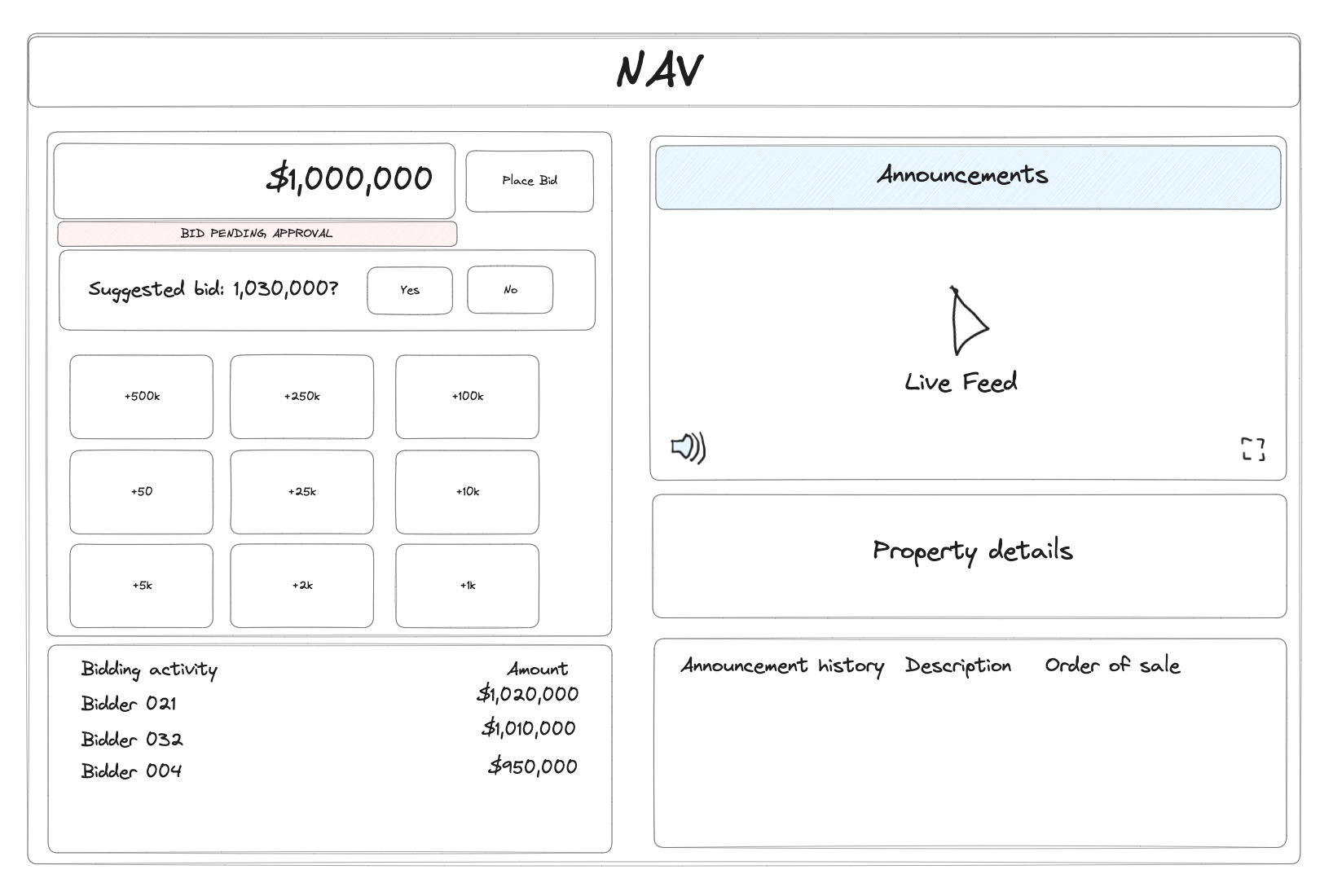
Another key aim from a design perspective was for everything to happen above the fold - allowing users to make bids, see the activity and view the live feed and announcements without any scrolling.
Using knowledge gleaned from buyer interviews, building off the archetypes I had previously created, together with our SMEs, we mapped the steps a buyer takes to register and take part in an online auction in a workshop.
We identified 4 key scenarios for registration. For the auction itself, we mapped a “winner’s” journey, an “unsuccessful” journey and a “follower’s” journey. We mapped the user’s steps, what was happening behind the scenes (the things the facilitators were doing e.g the auctioneer, agent and assistant etc) as well as any problems/opportunities at the relevant steps.
We used these maps to highlight opportunities and prioritised which ones we were aiming to solve in our new designs.
Journey maps
This journey map showed the steps a user took through a live online auction along with the corresponding actions happening behind the scenes.
Design
We began mapping out the current registration process. We needed a re-think around this process to fully cater to the 4 scenarios we had identified.
User flows
Current-state user-flow - register to bid, join live auction and post auction - post auction.
The current experience used the same form for every scenario and returned the auction winner to the start of the form with no guidance on what to do next.
A future state user-flow of the registration process for someone bidding on behalf of someone else e.g a Buyer’s agent
Wireframes, prototypes and testing
A major flaw in the previous design was the fact that it was a long page with key information below the fold. This meant users were scrolling up and down alot to follow the auction and make bids. Sketching quick wireframes helped the team visualise how we might organise the space to accomodate the top tasks above the fold, placing priority elements in prominent places and tucking less important information away to make it easily scannable.
We tested lo-fi wireframes in desktop, and mobile formats to get confident about whether this layout would make sense to users before rapidly iterating designs up to high fidelity based on feedback and learnings.
One of the areas we spent time getting right was the bidding UI - we started out with the idea of using increments to enable bidders to just add on top of the previous bid using buttons with set amounts on them. However in testing, we heard from desktop users that they would prefer to type the amount they had in mind - we ended up using both concepts, a typed amount UI for desktop and an incremental UI for mobile devices.

Qualitative test data was synthesised collectively with the whole cross-functional team to build collective understanding as we iterated designs based on what we learned during testing
Initial sketch of the live auction tablet device layout

Early desktop wireframe - order of sale

Early desktop wireframes

Early mobile wireframes

Lo-fidelity mobile prototype

Mobile testing prototype - Outbid status

A high-fidelity listing page design - this is the entry point into the live auction
A quick demo of one of the test prototypes we used towards the end of our usability testing
What we learned
Balancing consumers’ needs (our end users) with those of our customers together with our business objectives is a difficult balancing act to get right!
As a UXer, my instincts told me to advocate for our end users and prioritise their needs - give them all the transparency they could want, tell them as soon as the reserve price is met, provide tools for them to message agents and ask questions directly at any time through the auction.
But by overlaying the lenses of our customers and Realtair’s own objectives and strategy, understanding what’s important for auctioneers and agents as well - to get the best price for their vendors - there are compromises and difficult decisions to be made, taking into account these often conflicting needs.
That said, qualitative feedback during the later stages of testing revealed that even though we made some compromises, the overall experience was still super easy for bidders to use and understand without the need to act on every insight.
Project overview
Company
Realtair
Role
UX Lead
Year
2022